
Page 102 - AC/E Digital Culture Annual Report
P. 102
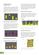
102Emotional activation comparison chartThis graph permits the comparison of average, maximum and minimum emotional activation levels and the 75 and 25 percentiles. This mea- surement has no units but it is useful for com- paring the relative emotional intensity between the tasks.the execution time relative to the area covered in each task with regard to average, minimum, maximum and 75 and 25 percentiles. The gradu- ation of the chart is in seconds and seconds/m2 (normalized) allowing the results between the tasks to be compared.Emotional activation dynamicThis graph allows the evolution of the emotional activation of each participant to be observed and o ers information on the zones that have the biggest impact. It also shows the variations in execution time.Emotional impact comparison chartThis graph allows the average, minimum and maximum and 75 and 25 percentiles of the levels of emotional impact to be compared. This measurement has no units but it is useful for comparing the relative emotional intensity between the tasks.Translation of diagram: Emotional activation of participant3. P5= participant 5. Start of participant 7’s task. End of participant 6’s task. Total execution time for the participants.Emotional activation mapThis map shows the spaces that triggered the biggest emotional activation in red. (In this case the chart corresponds to an example that is a retail outlet as opposed to art so that the e - ciency of the chosen retail spot could be measured)Translation of diagram: Emotional activation triggered by the zone. Entrance. Exhibits. Collection A/B. Season A/B/C. Basic. Innovation. Stimulus. Check out.Execution time comparison chartThis graph facilitates the comparison of the distribution of the execution time as well asWHERE ART MEETS NEUROSCIENCE · XIMO LIZANASmart culture. Analysis of digital trends
